Keyona is a young jewellery brand focused on silver jewellery, built for a digitally driven audience. The brand operates in a highly competitive online market in India, shaped by rapid growth and dense category presence. The initial requirement was to create a clear and distinctive position that could help Keyona stand out while remaining relevant to modern consumers.
This phase marks the beginning of Keyona’s positioning journey. It sets the groundwork for future communication, product storytelling, and brand growth in the online jewellery space.
From strategy development to identity creation, this phase established how Keyona presents itself visually and verbally. The work involved shaping the brand’s tone, typographic identity, visual mood, and overall direction, ensuring consistency across all initial touchpoints.
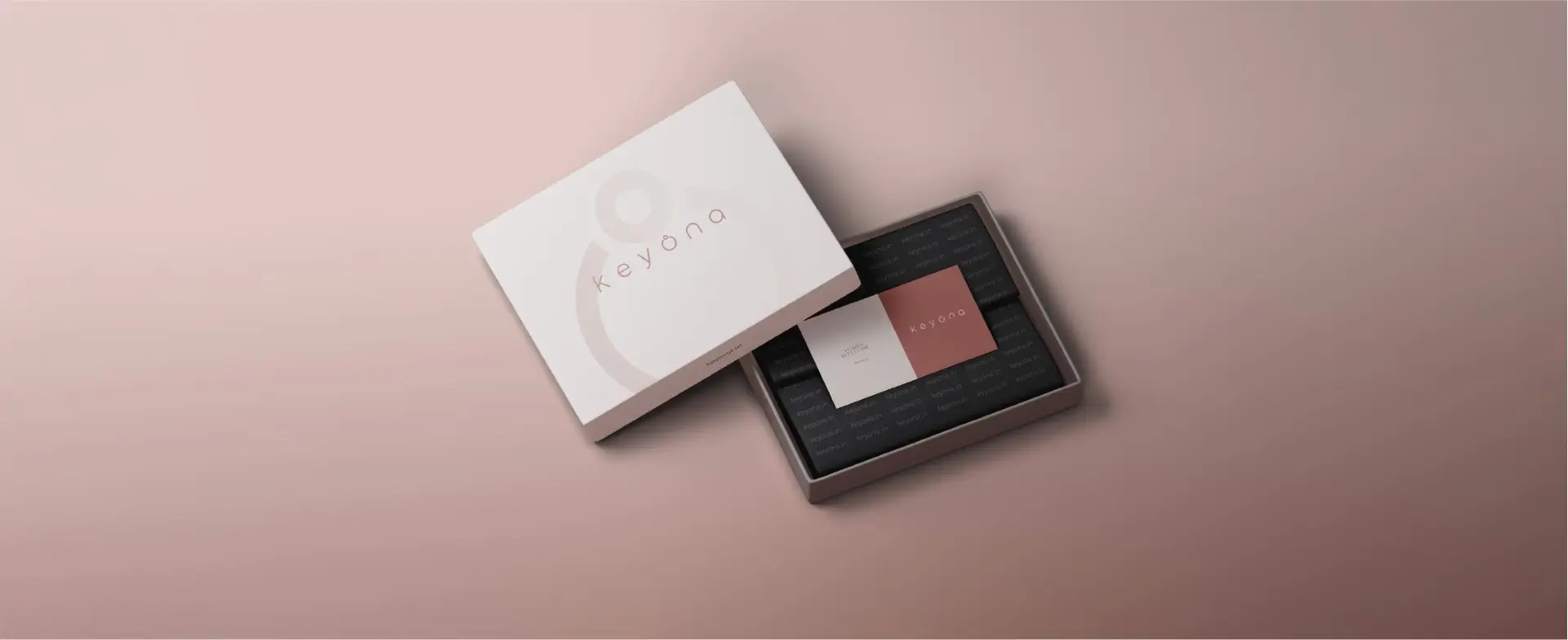
Identity Development
The concept focuses on a custom typographic identity.
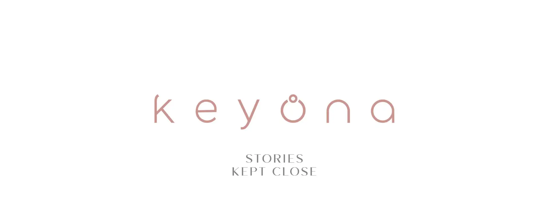
The word Keyona is crafted in fluid, minimalist custom letters, giving it a distinct and contemporary feel. The custom design of the letters is intended to resonate with modern trends and appeal to the sensibilities of today’s audience, giving the brand a unique and recognizable visual presence.
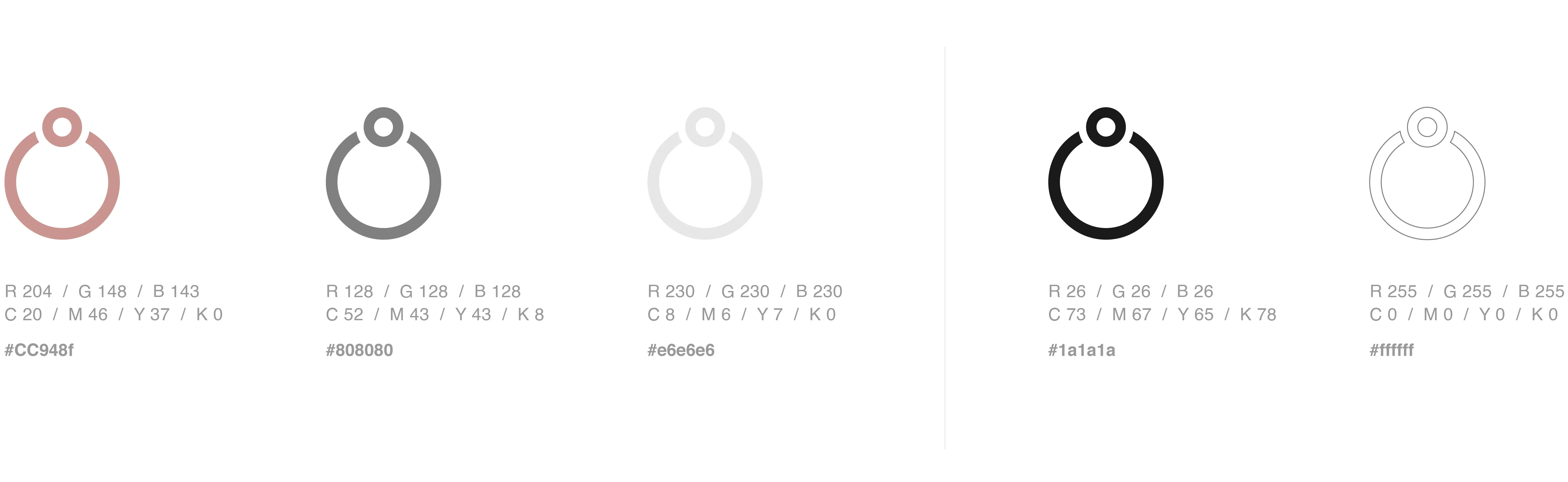
The standout feature of the logo is the letter O, which has been shaped into an ornamental form. While it is not a literal shape of ring, the treatment carries the essence of jewelry, making the logo directly relatable to the brand without being overly literal or product-specific
The typography is balanced and spacious, designed to work across all scales, from subtle engravings to large signage. The ornamented O also has the potential to function as a shorthand brand mark, serving almost like a signature detail.
The logo is more than just an image. It is a pure expression of the brand and serves as the primary identity, carrying significant weight in the brand’s overall communication.
The Keyona logo uses strategic spacing based on the proportions of the letter e. This letter has also been used to measure and maintain consistency across all four corners of the logo, ensuring balance and harmony in the design.
The indirect representation in the logo is the letter O, which is subtly ornamented to suggest the form of a ring. This detail also follows the same proportional guideline using the letter e, maintaining a consistent and structured approach while adding a refined nod to the brand’s connection to jewelry.
Identity Development
The tagline “Stories Kept Close” reflects the intimate and personal nature of the brand.
It emphasizes that jewelry is more than adornment, with each piece holding meaning, memories, and moments that are cherished. The words capture the emotional connection between the wearer and the story behind every creation, reinforcing Keyona’s commitment to elegance, thoughtfulness, and timeless relevance.
Production
Product Photoshoot
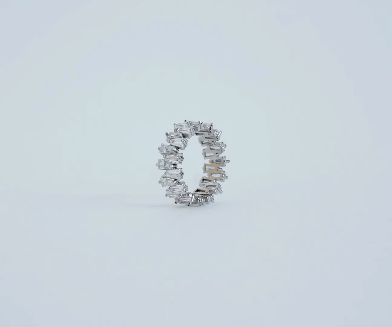
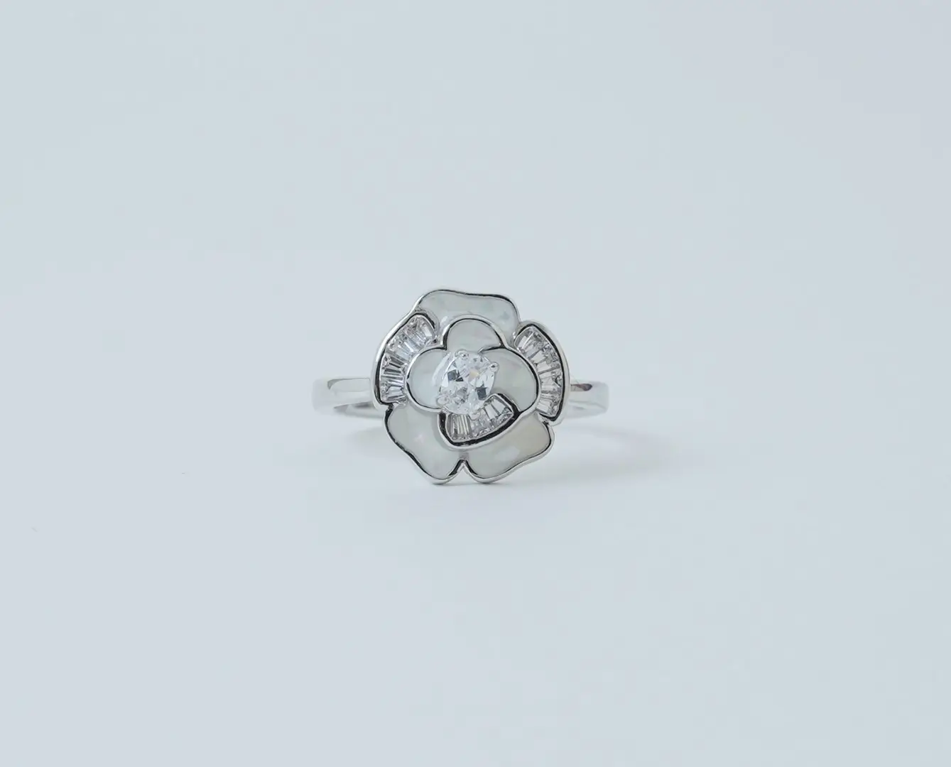
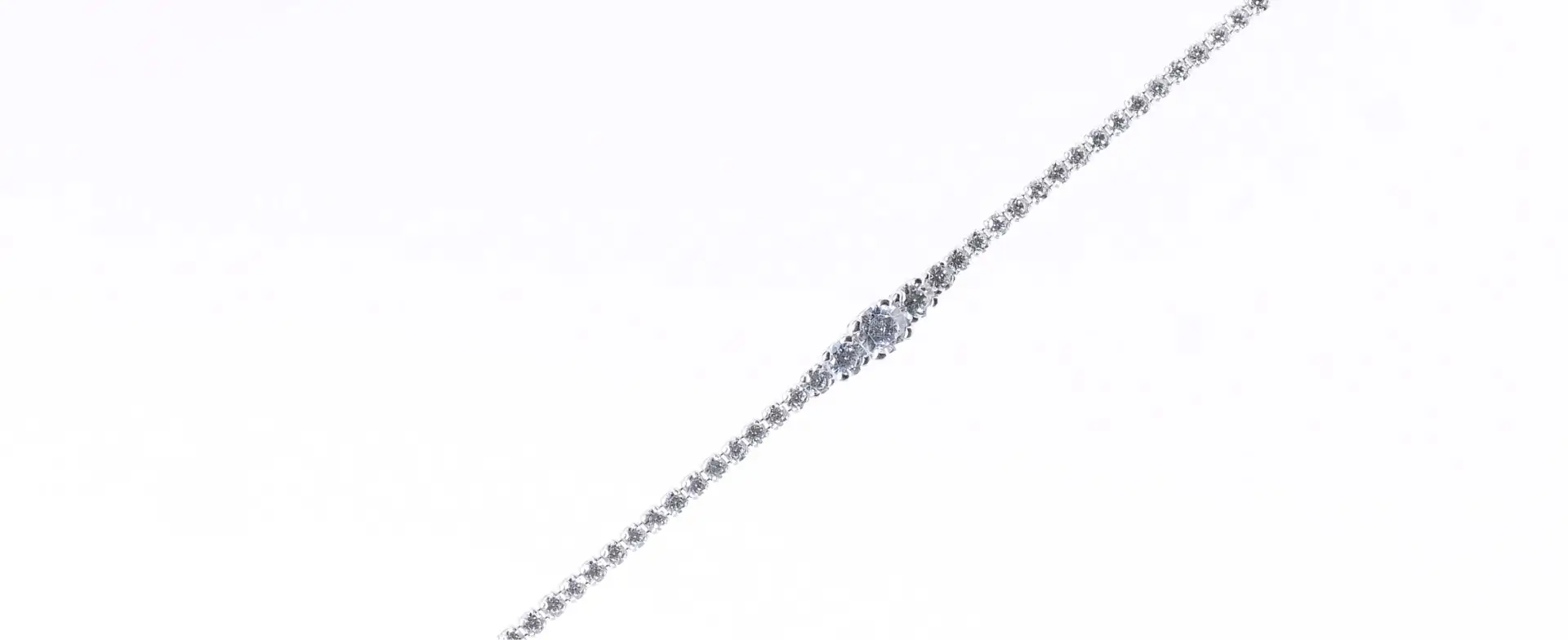
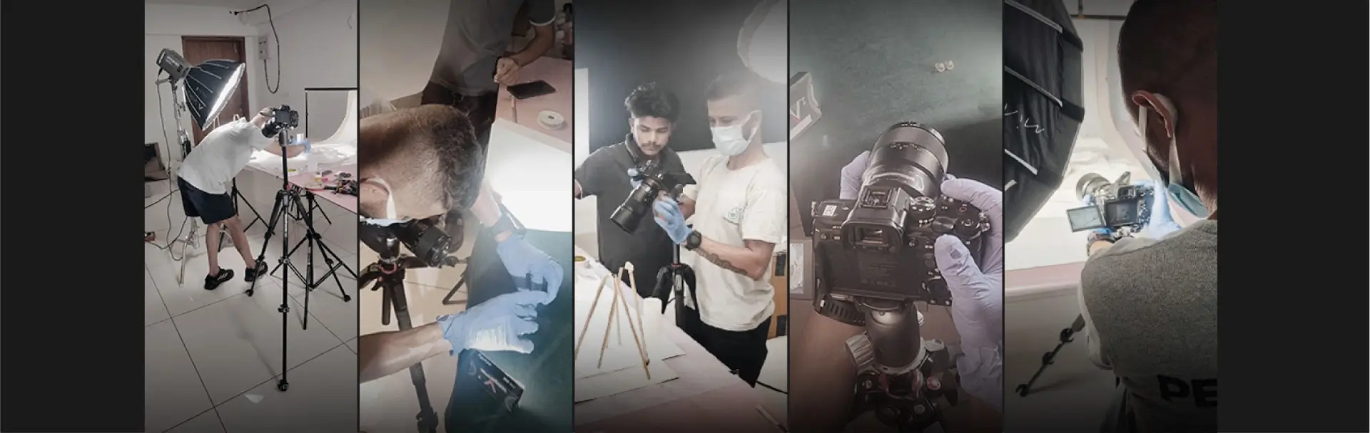
In the digital jewellery space, photography plays a critical role in how a brand is perceived. With limited physical interaction, imagery becomes the primary way customers understand product quality, craftsmanship, and value. For brands like Keyona, consistent and well-considered product photography is essential in establishing credibility, clarity, and a distinct visual position in an overcrowded online environment.
Typography
The choice of typefaces defines the tone of communication, ensuring clarity, consistency, and character across all touchpoints.
Primary Typeface
MIAMO is the brand’s primary typeface. It is used in all caps for taglines, headlines, and special titles where the brand needs to make an impact. As the primary font, MIAMO defines the visual tone of Keyona’s display text and helps create a consistent, recognisable look across brand touchpoints.
Secondary Typeface
Helvetica Regular serves as the secondary typeface, chosen for its clarity, simplicity, and timeless appeal. It supports the primary typeface by maintaining readability and balance across all brand communications. Along with Miamo, they form a cohesive and versatile typographic system.
Colour System
Production
Product Photoshoot
In the digital jewellery space, photography plays a critical role in how a brand is perceived. With limited physical interaction, imagery becomes the primary way customers understand product quality, craftsmanship, and value. For brands like Keyona, consistent and well-considered product photography is essential in establishing credibility, clarity, and a distinct visual position in an overcrowded online environment.
Operating in a competitive digital jewellery space, the focus was not just on individual outputs but on creating a system that works together. Strategy, identity, typography, visual mood, and production were aligned to support a cohesive brand position that can evolve with time.
Laying the Groundwork
This case study captures the first phase of work done for Keyona, focused on building a clear foundation for the brand. From defining the initial strategy to shaping the identity and visual direction, the effort was aimed at creating clarity, consistency, and purpose in how the brand presents itself.
This phase establishes the base on which Keyona can grow. It sets a direction for future communication, expansion, and refinement, while ensuring the brand enters the market with a considered and consistent presence.
Project or Idea, big or small, It matters.
We'd love to hear that.
better get
Your message has been submitted. We will get back to you within 24-48 hours.
Oops! Something went wrong while submitting the form.


-.webp)
-.webp)
-.webp)
-.webp)