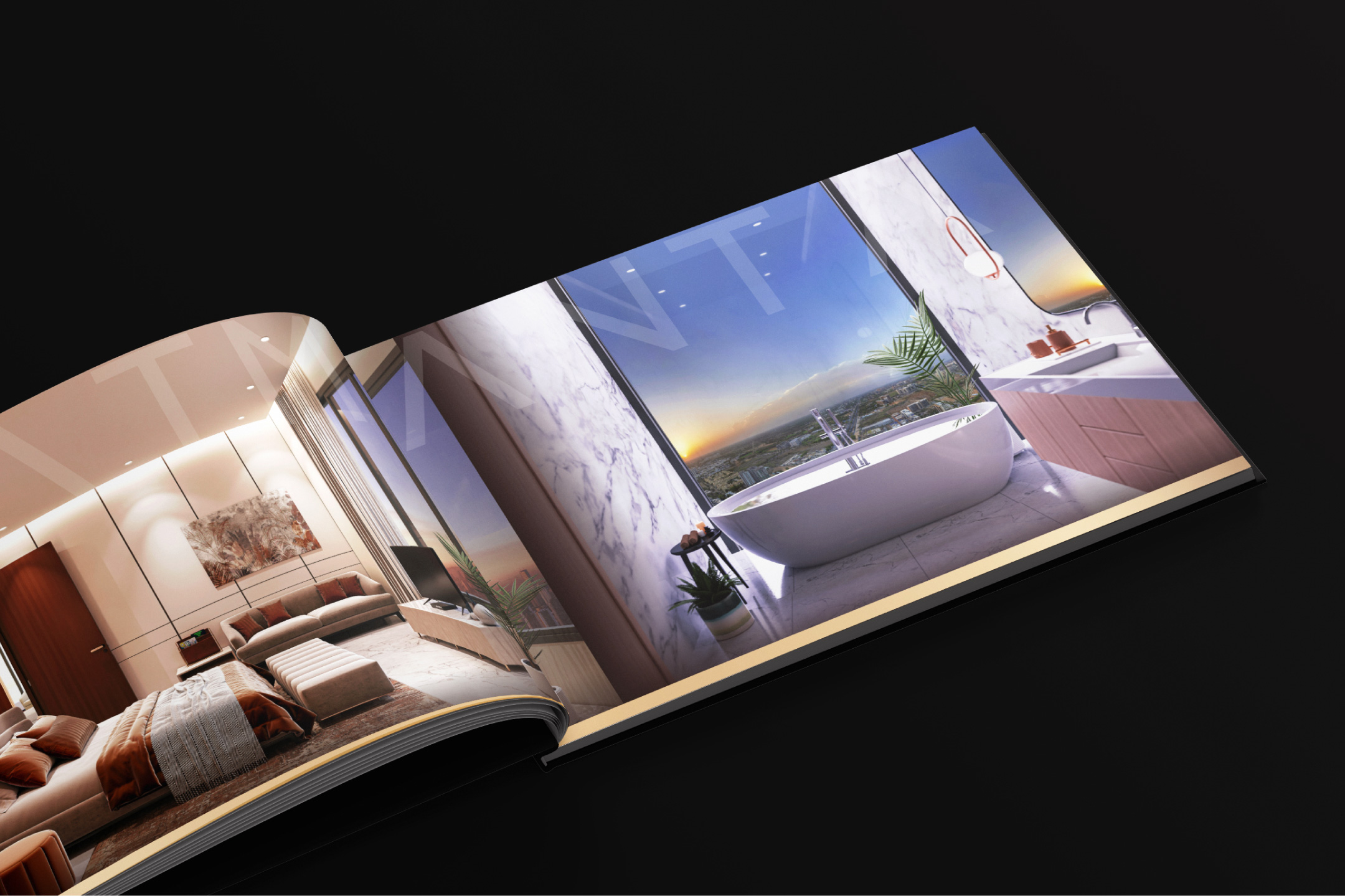
Aatmantan is a 32-storey premium residential development by Shankus-Aristo, located on SG Highway, Gota, Ahmedabad. With expansive 4 BHK residences and exclusive 5 BHK penthouses, the project is positioned to appeal to homebuyers seeking refined, spacious, and meaningful living experiences.
Sold partnered with the brand to build Aatmantan’s identity and market presence from the ground up. Our involvement included strategy, brand identity, tone of voice, project positioning, outdoor campaigns, social media marketing, website design and development, content creation, and production.
Premium Residential & Commercial Development
Project Breakdown
Strategy I Tone Of Voice I Tone Of Voice I Project Positioning I Identity Development I Brochure I Performance Marketing I Site Branding I Production I Website Design & Development
Strategy
Detailed market research and close observation of industry trends helped shape a full-spectrum positioning strategy.
The initial client briefing clarified the intent — Aatmantan was to be placed under their flagship ‘100mtrs’ category, reserved for their most premium developments. With a robust list of features and high-end amenities, the project represented uncompromising luxury. Our strategic direction aligned with this intent, positioning Aatmantan as a standout in the premium and luxe segment.
Project Positioning
The objective was to position Aatmantan as a distinctive, modern, and premium residential project that cuts through the clutter of a saturated market and appeals to an audience seeking meaningful living and sheer luxury.
Aatmantan’s core idea — the alignment of atma (soul), mana (mind), and tann (body) — served as the foundation for the overall project experience, influencing both its visual language and communication strategy. This principle shaped every aspect of the project’s expression, from the tone of voice to the identity system, spatial narrative, and lifestyle portrayal.
Tone Of Voice
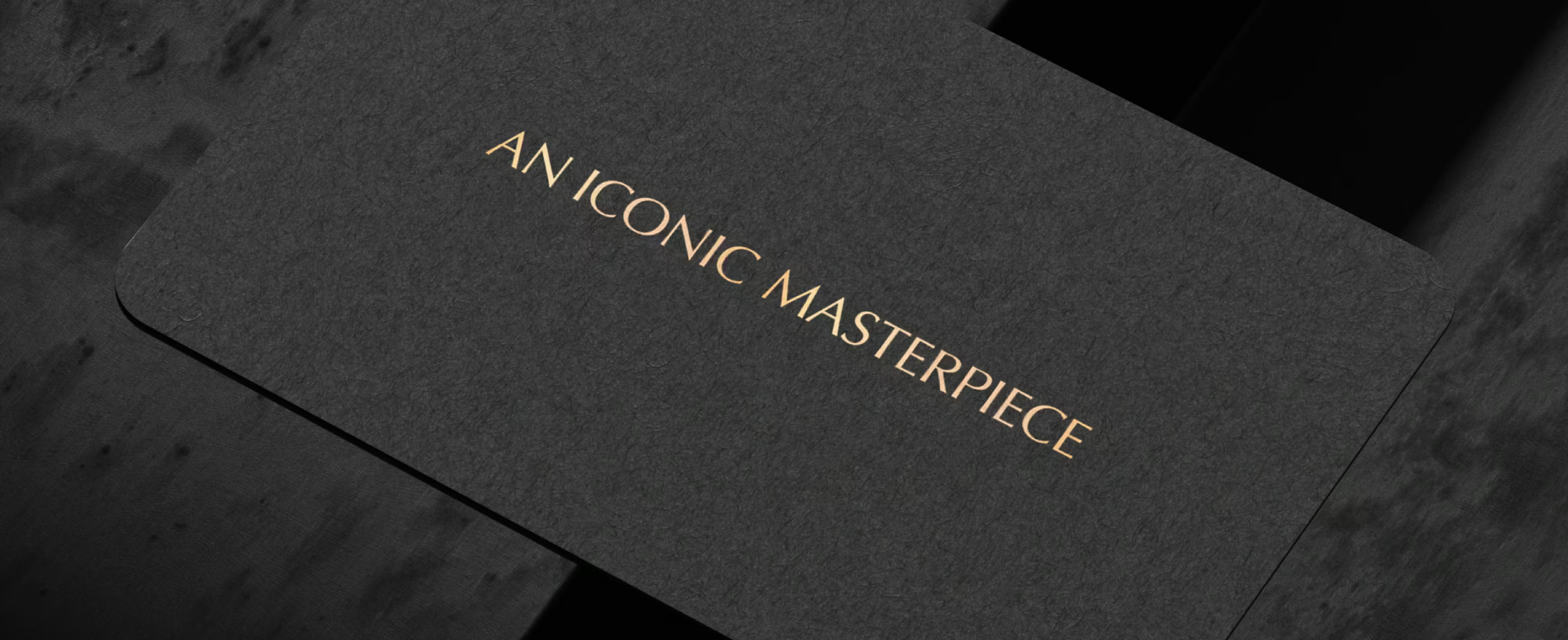
AN ICONIC MASTERPIECE
An Iconic Masterpiece defines the tone of voice for Shankus-Aristo’s Aatmantan: bold, elevated, and unmistakably premium. As a 100mtrs flagship development, the language conveys both stature and restraint, deliberately avoiding excess. Every touchpoint subtly reinforces the vision of refined living. The tone carries a profound sense of sophistication and strength, aligned with the high standards expected from Shankus-Aristo’s premium line.
THE ICONIC 100 MTRS
Aatmantan is part of Shankus-Aristo’s prestigious 100mtrs development category, a mark of height, ambition, and uncompromised quality.
These landmark projects are built to stand taller, not just in form, but in experience and intent. The 100mtrs standard doesn’t just shape the skyline; it defines how premium living is imagined. Aatmantan carries this vision forward with clarity, scale, and purpose.
Identity Development
AATMANTAN is designed in a simple, typographic style with generous character spacing, giving the logo an elegant and highly readable appearance. The smooth golden gradient adds a touch of sophistication and luxury, enhancing its overall look.
Once the Aatmantan logo was approved, the client sought a similar design approach for upcoming and ongoing projects such as AAYAM and AMAYA. While these tasks were managed separately, the chosen style was regarded as the most fitting for maintaining consistency across all projects.
Color Palette
Outdoor Campaigns / Billboards
We successfully executed a series of Teaser and Reveal outdoor campaigns for Aatmantan, bringing the project’s tone of voice to life, particularly with the powerful positioning of “The Iconic Masterpiece.” The campaigns captured attention and significantly boosted both the speed and volume of enquiries.
The design was bold and dramatic, incorporating the project's façade (elevation) on the billboards, creating a striking visual impact that sparked curiosity and intrigue.
The outdoor campaign ran throughout the timeline, maintaining momentum and consistently attracting attention, further solidifying the project’s presence in the market.
Reveal Campaigns
Reveal Campaigns
Brochure
In the initial discussion, the client made it clear—they didn’t want just another regular brochure. Back in the studio, we took that seriously, choosing premium materials like faux croc-leather fabric, CNC-cut impressions, and high-grade paper stock. The layout extended Aatmantan’s tone of voice with dramatic visuals, high-quality 3D renders, and precisely detailed floor plans.
The final brochure was placed in a matching faux croc-leather bag, featuring the same project labelling as the brochure cover — a subtle, consistent touch of class. The client was genuinely satisfied, which made the entire effort worth it.
Premium Materials & Finish
In the luxury space, materials speak before words do. Every element from the faux croc leather fabric to the CNC cut impressions and premium paper was chosen to reflect Aatmantan’s refined identity.
The tactile experience reinforces the brand’s elevated positioning and turns the brochure into more than a document. It becomes an extension of the lifestyle it represents.
Preparing for Aatmantan’s Next Phase
With Aatmantan actively under development, our involvement with the project continues to grow. As each phase progresses, we are strategically planning the next set of stories, content, and releases that will drive the project forward. Our team is dedicated to continuous brand auditing, ensuring that all touchpoints stay aligned with the evolving vision. By consistently reviewing and refining our efforts, we’re able to maintain the project’s momentum and ensure its presence remains strong, relevant, and consistent.
Premium Residential Project by
Project or Idea, big or small, It matters.
We'd love to hear that.
better get
Your message has been submitted. We will get back to you within 24-48 hours.
Oops! Something went wrong while submitting the form.